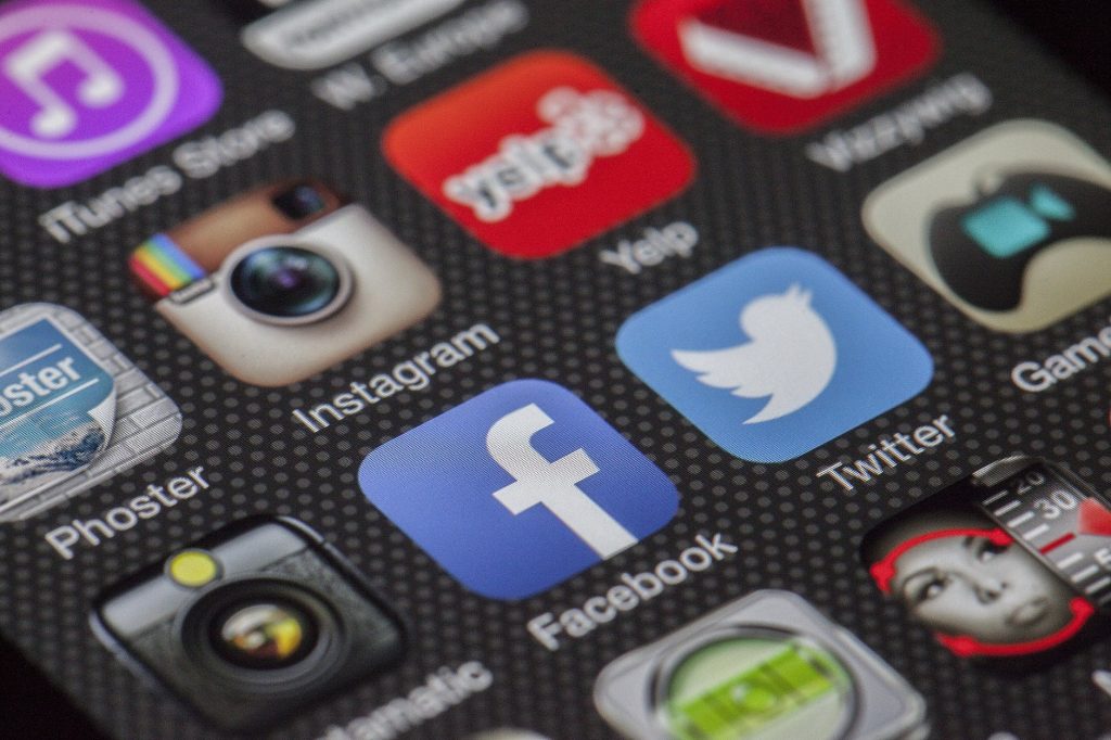
Since the increase in use of smartphones, we see more and more people do online browsing on their mobiles. And because of this, mobile web design has progressed by leaps and bounds. Here are some of the trends we predict for 2018.
Mobile First
Thanks to mobile browsing, designers had to adapt their designs quickly to suit and fit small mobile screens. HD images are ditched in favor of lightweight icons, which allowed the creation of menus, submenus, and subsubmenus that easily load.
Drop shadow and depth
Over time web design has moved from flat to 2D to 3D. This is with the help of using shadows. By doing so, design has depth and gives that 3D effect. We also have to mention Shadowplay, which improves design aesthetics and enhances user experience.
Big, bold typography
Complementing custom images are custom font that also give character to a brand or business. Most browsers support handmade typefaces. Having custom typography greatly and positively impacts a site’s SEO which will make readers keep coming back.
Asymmetry and broken grid layouts
This trend came out in 2017 and will continue to go strong in 2018. Its appeal lies in giving off an individual and unique vibe that is attractive to both brands and consumers. It gives designers so much leeway in terms of creativity and helps designers think out of the box and push the limits every single time.
Custom Illustrations
Nothing creates brand or product recall faster than custom images. It screams of uniqueness and individuality in a sea of millions of brands that try to catch the audience’s attention. The beauty of it is that it is not only for select businesses but also for brands and businesses that are perceived as too serious, sober, or solemn.
Particle backgrounds
Another breakthrough in web design is the use of particle backgrounds. The movement on screen makes the design come more alive, more eye-catching. The sweet deal about it is that it does not take a long time to load, thanks to the lightweight javascript used.
Integrated animations
Movement on screen is always a come-on and we will see this more and more in the coming years. Integrated animations is different from particle backgrounds in the sense that the latter deals with large images, while the former animates small images on the site. Integrated animations are used when a user scrolls or while waiting for a page to load. This kind of animation engages users and improves UX.
Dynamic gradients
Gradients already made a showing in previous years but are slowly making a big comeback. The difference now is that gradients are bigger and bolder. They add a sense of intrigue to images that seem ordinary.
Vibrant, saturated color schemes
In 2018, we see web designers taking more risks with color. In the past, designers stuck with safe, conservative colors and layouts. But now, we see bolder layouts and color schemes. This is complemented by HD monitors and screens so users can appreciate the richness of the colors.
2018 will be an exciting year in terms of web design with all the possibilities just in front of us


